Overview
SBI Pro is a B2B SaaS analytics platform designed to help businesses analyze complex data and make informed decisions. However, its fragmented interface, inconsistent UI, and scattered workflows created usability challenges. Users struggled to navigate the platform efficiently, slowing down their ability to extract key insights.
To address these challenges, I redesigned the user experience and implemented a scalable design system, ensuring consistent UI components, intuitive data visualization, and a more seamless workflow. This transformation not only improved usability but also set a strong foundation for the platform’s long-term scalability.
Problem

Inconsistent UI
Overcomplicated Workflows
Overwhelming Data
Limited Accessibility


1.
User Research and Insights
User Interviews:
Understanding User Pain Points
I conducted video interviews with business analysts, decision-makers, platform users, outside designers, and internal stakeholders to identify usability challenges.
I prepared a focused interview guide covering navigation struggles, data interpretation, and overall user experience. By asking open-ended questions, I gained insight into how users interacted with the platform daily and where they faced difficulties.
I also observed live screen-sharing sessions, which helped me see exactly where users got stuck or frustrated, providing key insights for the redesign.


User Interviews Key Findings

Inefficient Workflows
Users felt that simple tasks (like filtering data or generating reports) required too many steps, making the platform feel slow and unintuitive.
Overwhelming Data
Users struggled to extract insights because dashboards displayed too much information at once, making it hard to focus.
Limited Accessibility
Users with different technical backgrounds found the platform difficult to navigate without prior experience or training.
Usability Audits:
Identifying Workflow Inefficiencies
To complement user interviews, I conducted a usability audit to identify interaction bottlenecks and inefficiencies across the platform.
I mapped user journeys to pinpoint where users got stuck or took unnecessary steps, highlighting areas for improvement. By measuring time-on-task for key actions like generating reports, filtering data, and accessing insights, I uncovered workflow slowdowns that impacted efficiency.
Additionally, I evaluated UI consistency, identifying misaligned elements, inconsistent button placements, and unclear labels that contributed to confusion.
These insights helped shape a more streamlined and intuitive experience.

Usability Audits Key Findings
Fragmented Navigation
Users had to jump between multiple sections to complete a single task, leading to inefficiency.
Inconsistent UI
Misaligned UI elements, inconsistent button placements, and unclear labels created confusion and slowed down interactions.
Limited Sharing & Exporting
Important collaboration features were either missing or difficult to use, preventing users from efficiently sharing insights.

With enough data in hand, I proceeded to the next step — building the design system.
02.
Building a Scalable Design System
Addressing UI Inconsistencies with a Systematic Approach
Through user research and usability audits, it became clear that UI inconsistencies, misaligned components, and unclear navigation were creating a fragmented user experience.
The best solution was to develop a scalable design system using the Atomic Design approach, ensuring consistency, efficiency, and future scalability.
Atomic Design Approach & Its Benefits
To create a structured and scalable UI, I implemented the Atomic Design methodology, which organizes UI components into five levels:
ATOMS | MOLECULES | ORGANISMS | TEMPLATES
By structuring the Design System this way, I ensured modularity, reusability, and consistency across all UI elements. This approach allowed developers to reuse components efficiently, reducing design debt and speeding up implementation.
Atoms
Atoms are the fundamental building blocks of the design system. They include colors, typography, icons, and values (numbers) — the smallest elements that shape the visual and functional identity of the platform. These foundational elements ensure consistency across all UI components and maintain a cohesive look and feel.

Colors
A defined palette of colors ensures consistency, accessibility, and adaptability across light/dark modes and permission levels.

Typography
A structured typography system with predefined sizes, weights, and styles for clear hierarchy and readability.
Icons
A cohesive set of scalable, high-contrast icons that enhance usability and provide intuitive visual cues.

Values
Standardized numerical formats, including spacing, padding, border radius, ensuring design precision and alignment.
Molecules
Molecules are simple combinations of atoms that work together as functional units. Think of a search bar (input field + icon + button) or a form label + text input. These components introduce basic interactivity and usability patterns.


Organisms
Organisms are more complex UI sections built from molecules and atoms. These could be navigation bars, cards, modals, or dashboard widgets — components that users interact with at a higher level. Organisms ensure a structured and reusable UI.

Templates
Templates define the structure of pages by arranging organisms into a coherent layout. These templates determine where components go and how they interact, ensuring that screens remain visually and functionally consistent.


With the System structure set, I moved on to organizing components and tokens.
03.
System Management: Components & Tokens
File Organization (Figma)
To maintain a structured and scalable workflow, I implemented a well-organized Figma file structure that allowed designers and developers to find and update components quickly. By categorizing elements logically — such as UI components, design patterns, and shared assets — I ensured that the design system remained easy to navigate and scalable as the product evolved.


Tokens – Key to Consistency
Tokens are the foundational elements that define and store reusable design values for the SBI Pro and Apex platforms. They encapsulate styles like colors, typography, spacing, and motion, ensuring consistency across all components and levels of the design system.
Color Tokens: Define primary, secondary, and status colors (e.g., "primary-blue"), enabling easy updates across light and dark modes.
Typography Tokens: Specify font families, sizes, and line heights for consistent text presentation.
Spacing Tokens: Set standards for margins, padding, and layout spacing to streamline alignment.
Corner Radius Tokens: Define consistent rounding for elements like buttons, cards, and modals to maintain a unified aesthetic.
By leveraging tokens, the design ensures scalability, quick updates, and seamless alignment across the entire platform, reducing errors and ensuring design harmony.


Dark/Light Mode
The platform supports both dark and light modes, improving accessibility and adaptability to different environments. The token system ensures all styles—colors, shadows, and corner radiuses adjust smoothly between modes. Using Figma’s mode-specific styles, designers and developers could toggle between themes during prototyping, making transitions seamless and consistent for users.
This structured approach integrates flexibility into the platform's core, maintaining usability and visual coherence.


SBI Pro vs SBI Apex: Maintaining Brand Identity
The token system also facilitates effortless switching between the distinct color themes of SBI Pro and SBI Apex. This ensures that each platform retains its unique branding while remaining consistent with the overall design system. By using global and brand-specific tokens, I created a seamless experience across both platforms without requiring redundant design efforts.


04.
Product Solutions
Product Tools
SBI Pro is designed to deliver clear, data-driven insights, so I led the design of several tools that help users make strategic decisions with confidence. My role involved defining the user experience, structuring information for clarity, and ensuring seamless navigation to make these tools accessible for all expertise levels.
Key Tools:
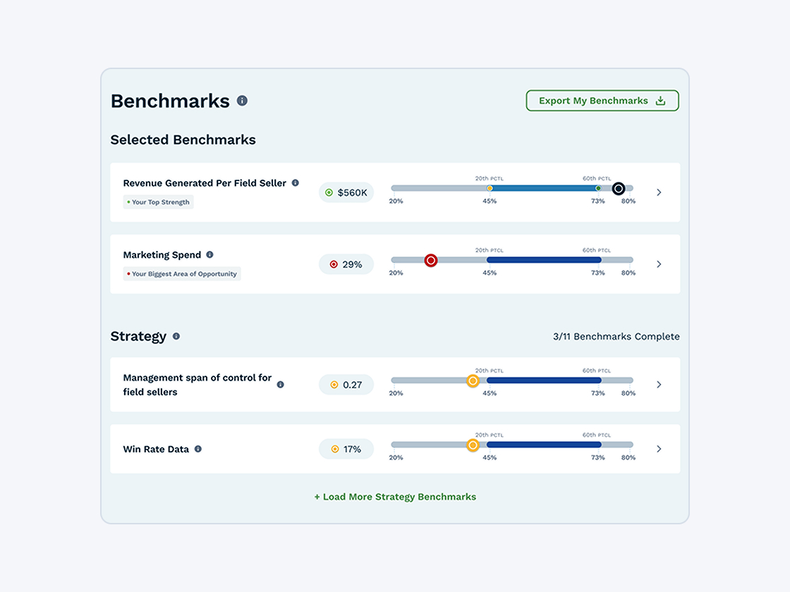
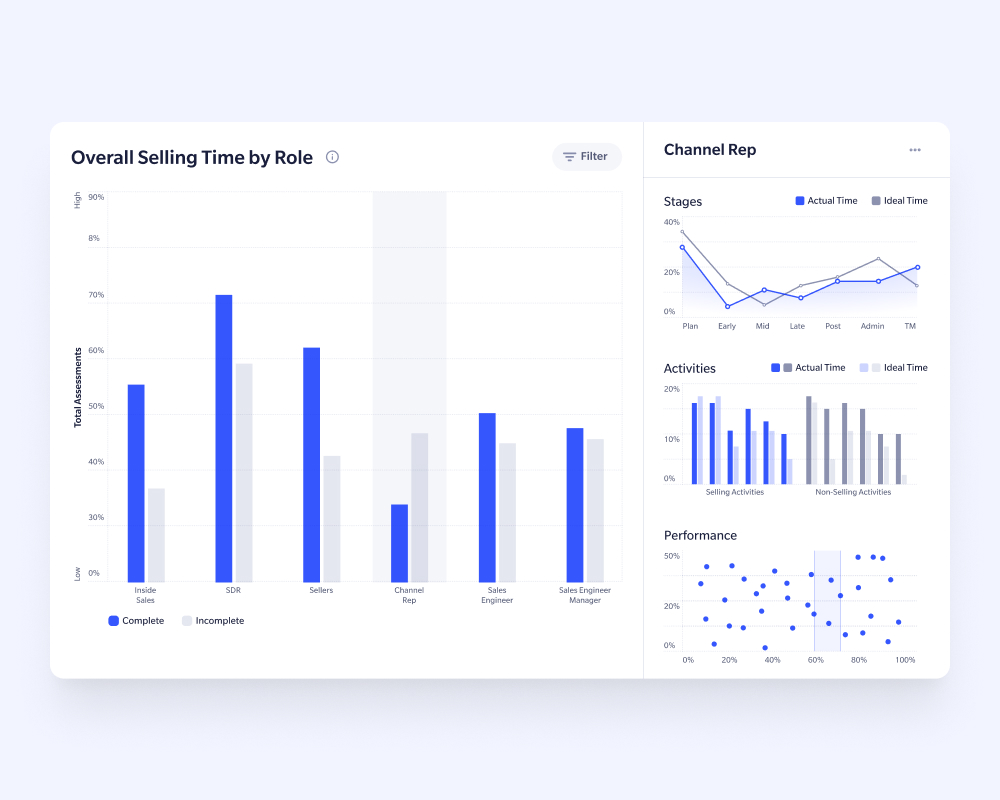
Talent Assessment Dashboard: Aligns team skills and performance metrics with strategic goals. I designed bar graphs and trend lines to help users quickly identify skill gaps and development opportunities.
Revenue Growth Roadmap: An interactive tool that visualizes projections, target comparisons, and action steps to help businesses meet their growth objectives. I ensured that complex financial data was presented in a way that is intuitive and easy to act on.
Time Study Tools: Helps leadership analyze how teams allocate time to optimize productivity. I structured the pie charts and heatmaps to highlight trends and areas for improvement efficiently.
Each tool follows a consistent visualization system, incorporating bar charts, line graphs, and heatmaps to allow users to zoom into specific metrics or get a high-level overview. I focused on maintaining visual clarity and usability, ensuring that insights are easy to interpret and actionable.


05.
Accessibility compliance
Ensuring an Inclusive Experience
Accessibility is essential to creating an inclusive experience, ensuring that all users—regardless of ability—can interact with the platform efficiently. From color contrast to keyboard navigation, every design choice was made with usability in mind.
By adhering to WCAG 2.1 AA standards, we created a platform that is inclusive and usable for individuals with diverse abilities. The design system and token framework made accessibility implementation more efficient, allowing consistent application of compliant styles across all components.
Key Enhancements
Color Contrast: All color tokens were tested to meet or exceed WCAG contrast ratios (minimum 4.5:1 for normal text and 3:1 for large text), ensuring readability in both light and dark modes.
- Helps low-vision users and improves readability across different lighting conditions.
- Prevents contrast failure in UI elements, ensuring clear visibility.
Typography and Spacing: Clear font hierarchies, sufficient line spacing, and generous padding were applied to improve legibility and usability, particularly for users with visual impairments.
- Supports users with dyslexia, cognitive impairments, or vision difficulties.
- Reduces strain from tight letter spacing or small fonts.
Screen Reader Support: Descriptive labels and alt text were added to key components, ensuring compatibility with screen readers for visually impaired users.
- Enables blind and low-vision users to understand and interact with the interface using assistive technologies.
- Helps clarify icons, images, and complex UI elements that lack text descriptions.
Focus States: Distinct focus styles were implemented for all interactive elements, making navigation clear for users with limited mobility or those using keyboard-only input.
- Crucial for users with motor impairments or those relying on keyboard navigation.
- Prevents users from getting “lost” when navigating forms, menus, and toolbars.


Results and User Impact
What Was Achieved?
The redesign of SBI Pro and Apex resulted in a more consistent, accessible, and user-friendly platform. By implementing a structured design system, optimizing dashboards, and ensuring accessibility compliance, we streamlined workflows and improved decision-making for users across all expertise levels.

Consistent UI
Simplified Workflows
Clearer Data Presentation
Enhanced Accessibility
What's Next?

Expanding the Design System
Continuous User Testing & Iteration
Enhancing Accessibility
AI & Automation Integration
Project gallery
Discover the polished designs that drive strategic decision-making and elevate the user experience.


Interested in working together? Get in touch today.
Have a question or just want to say Hi? Feel free to reach out — I’d love to hear from you!