S&P Global · 2025 – 2026
CorsaDS: Agentic Design Workflow
I built a design-to-code workflow that helps product teams turn prompts into production-ready React prototypes using typed props, semantic tokens, and automated validation.

Overview
S&P Global's AI research division, a small technically-oriented team, builds tools for analysts, institutions, and data teams worldwide. The product, Corsa, is a workspace where analysts run AI-driven research, build reports, and explore data.
I joined to develop a limited Figma design system into something the team could actually build from. That was the original scope. Halfway through, AI-assisted prototyping came onto the radar and changed everything.
Agentic, in this context, means Claude does more than respond to prompts. It calls tools, reads source files, understands product context, generates code, and checks its own output against system rules — without step-by-step instruction.
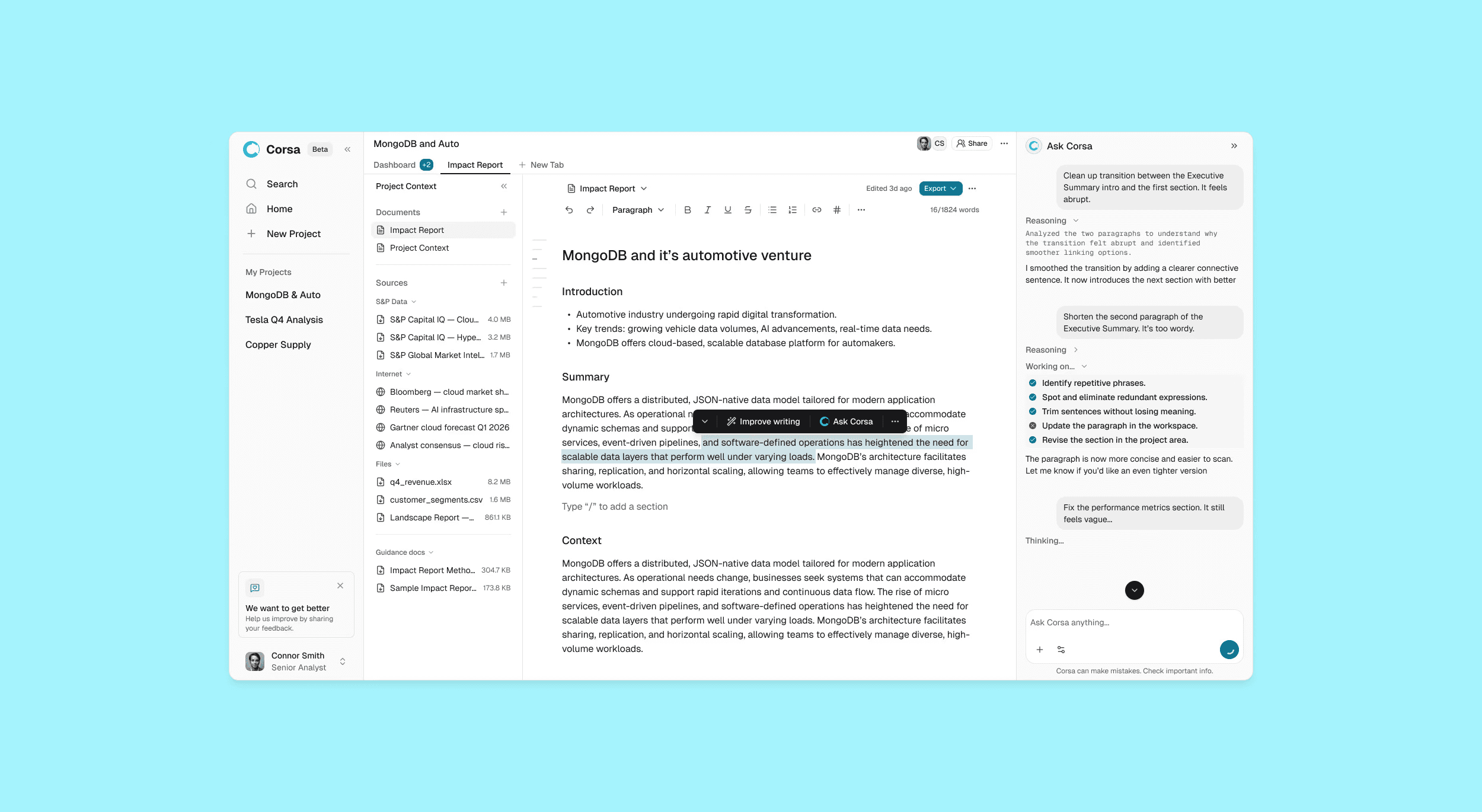
Before this, design and engineering worked in sequence. Designers built flows in Figma, handed them off, and waited. Engineers interpreted the designs and the gap between intent and output widened. CorsaDS collapsed that gap — design teams generate working React prototypes in minutes, engineers review real code instead of redlines.
Conversation moved from "what did you mean by this?" to "should we ship it?"
The Starting Point
When I arrived, the Figma design system hadn't kept pace with the product. Components were inconsistent, tokens weren't structured for scale, and there was no React implementation. Designers had no reliable way to prototype in the actual product language.
I started by rebuilding the foundation: audited the existing system, restructured the token architecture, and built out the React component library from scratch.

Problem
While I was building this, the team started exploring Claude to generate UI from prompts. Faster iteration, less time in Figma. The potential was obvious. So was the problem.
Every prototype came back broken. The errors were not random
Designers were spending 15-20 minutes on manual setup before every session. Engineers couldn't trust generated output. New team members had to learn the entire system before prototyping at all. And every prototype came back with the same four errors.
Guessed props
Invented components
Missing mandatory patterns
Hardcoded values
Each error had to be caught manually. Design review became a bottleneck instead of a quality gate.
The First Approach
My first instinct was documentation, and it made sense.
Claude is a language model. It reads, reasons about, and follows written instructions well. Markdown is how developers describe component APIs. I wrote contracts for each component covering what props it accepts, what patterns are mandatory, and what to avoid. I added routing rules, a prototype template repo, and context files loaded into every session.
It worked. Prototype quality improved noticeably. Then the components changed.
A prop would be renamed, a new required field added, and the markdown contract wouldn't update. Claude would follow the written contract correctly and still generate wrong output. I tried two alternatives after that.
Static contracts
Hook enforcement
Context injection
All three approaches failed for the same reason. Any static layer between Claude and the source would eventually diverge from it. I needed to eliminate the gap, not patch it.
Architectural Pivot
The problem wasn't what Claude knew. It was where the knowledge came from.
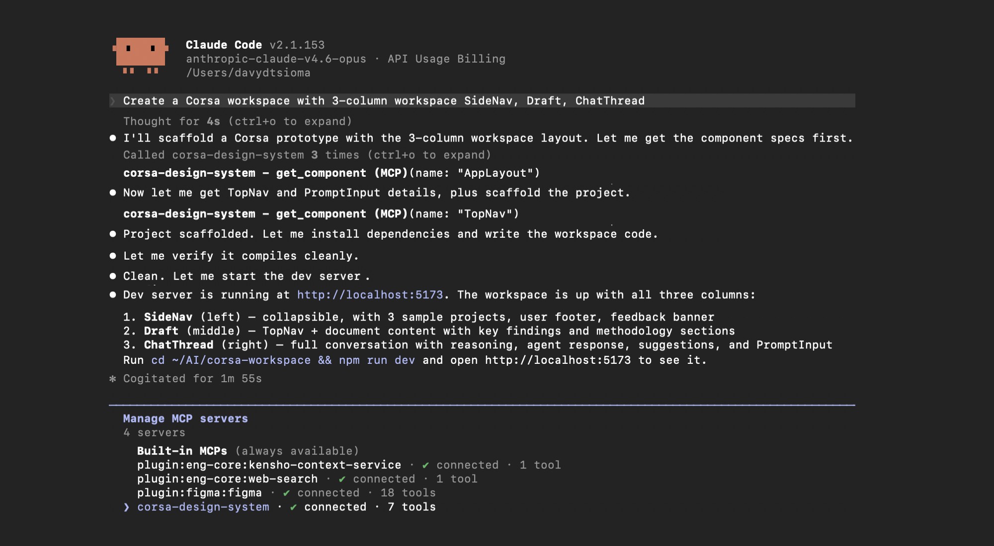
Claude shouldn't have to read static descriptions of components. It needed access to the component source itself. MCP (Model Context Protocol) is how external tools connect to Claude, similar to how plugins work in other software. I built a small server that gives Claude direct access to the component source files instead of any description of them.
When Claude needs to know SideNav's props, it calls get_component("SideNav") and reads the actual TypeScript definition from the repo. The component source became the contract.
This was the right architectural decision because it moved the problem from maintenance to infrastructure. Static docs require continuous upkeep. The MCP server reduced that upkeep by removing the static layer between Claude and the source.

The MCP Server
I did not start by listing tools. I started by grouping the repeated prototype failures into failure modes — guessed APIs, invented components, missing tokens, generic output, bad setup, and unvalidated results. Each tool maps directly to one of those.
MCP tool
Design decision
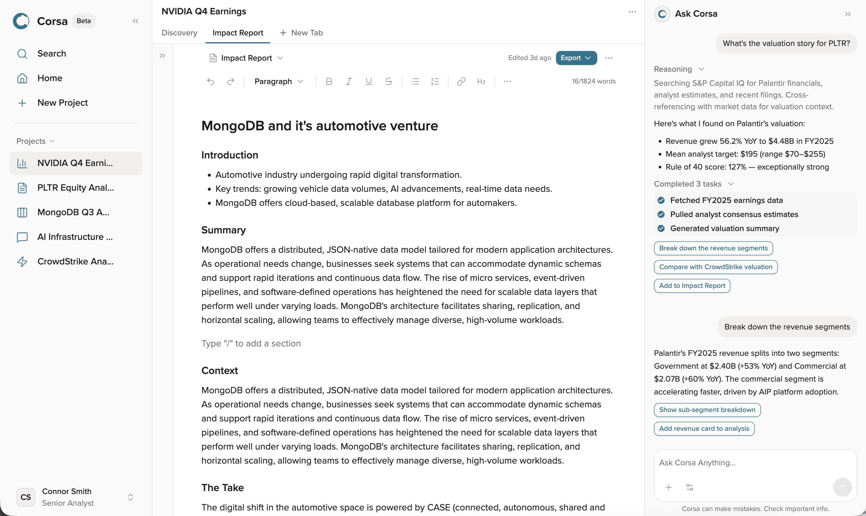
The server ships inside the DS repo. The designer describes the screen. The system handles the rest. The output is a working React + Tailwind prototype using real components and tokens. Engineers can open it, review it, or convert it into a PR — and they did. Prototypes generated by the design team gave engineers working React references for product builds.
The system is used by five designers, the head of design, the design PM, engineers for internal Corsa initiatives, and analysts exploring product flows. No React knowledge required for any of them.
The Sealed Architecture
Wrong prop, missing prop – no build.
Most design systems rely on documentation and convention. I decided to enforce correct usage at the compile layer instead.
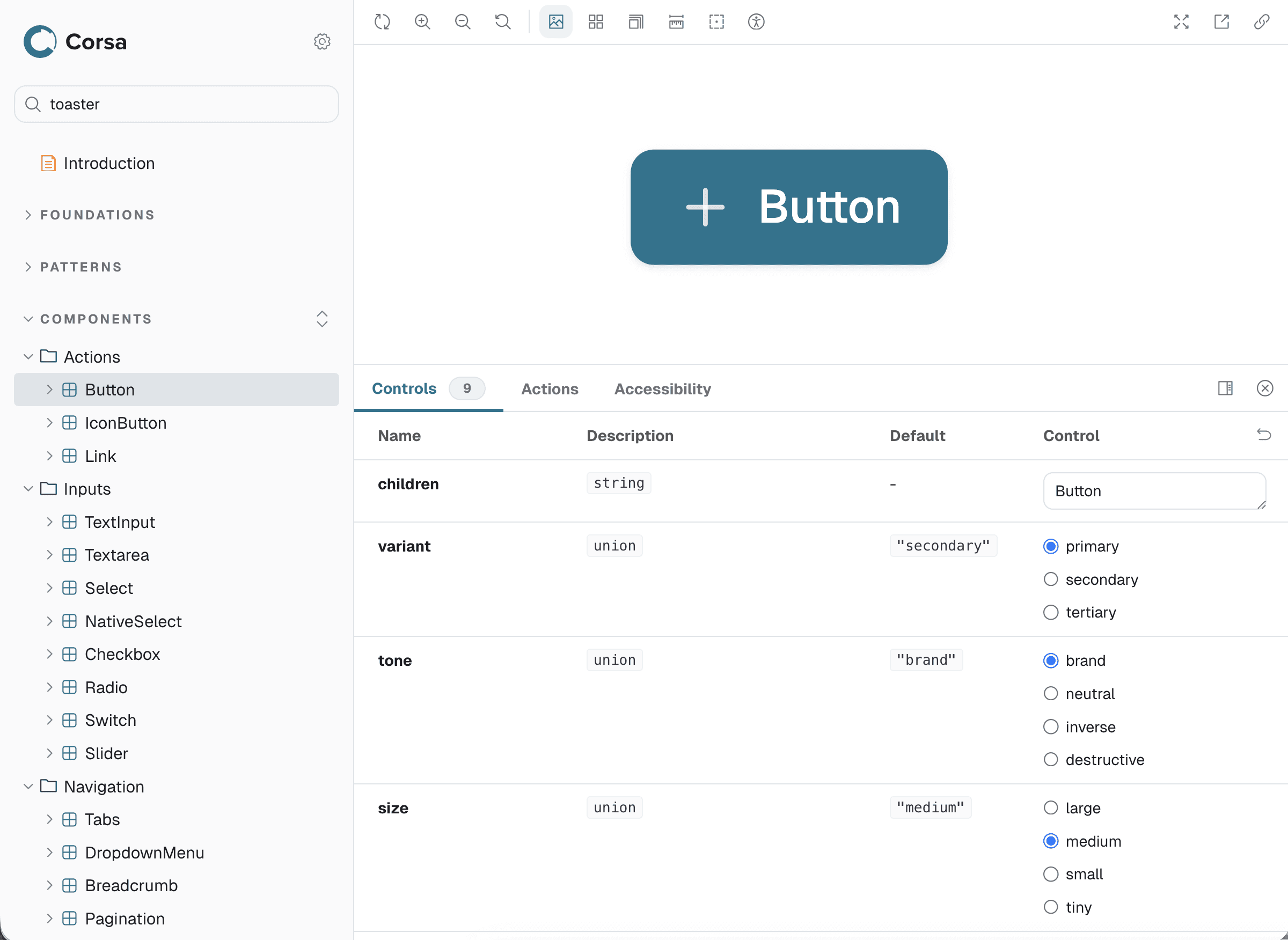
Every component's required props are TypeScript-typed. Wrong prop: won't build. Missing prop: won't build. The only path to a working prototype is correct usage.
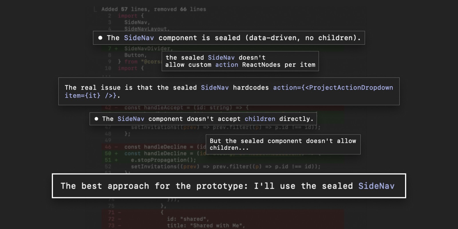
For the four most complex components I went further, moving to data-driven APIs. SideNav's mandatory items always render because the component enforces them internally. The components most likely to be misused are the ones that are hardest to misuse.
This eliminates an entire class of review failures. Not caught earlier. Eliminated.
Figma Sync
I established bidirectional sync between the code library and the Figma library so neither could drift from the other. 123 Figma variables match 123 code tokens, same names and values both directions. Code Connect links 33 components so engineers see <SideNav collapsible> instead of "a 280px sidebar" in dev mode.

Accessibility
A design system that enforces correct component usage but ships inaccessible tokens is only half the job. Before anything went to production, I audited the full token set for accessibility.
WCAG contrast ratios alone don't account for how colors appear under color vision deficiencies. Two colors can pass 4.5:1 and still look identical to someone with deuteranopia. I used ΔE2000 color-vision simulation to catch those cases — a perceptual distance metric that measures how different two colors appear under each CVD type, not just whether they pass a contrast ratio.
I audited all 120 semantic color tokens against WCAG 2.2 AA across light and dark modes and integrated axe-core into Storybook CI so every merged component is scanned automatically on deploy.
What Shipped and What Changed
Engineering teams don't ask to adopt design-built libraries. This one did.
2 min
prototype delivery, down from days of Figma work
1 cmd
prototype setup, down from 15-20 minutes manual configuration
40+
components now available to any team member with Claude Code
The larger value was not speed alone. Faster prototypes created an earlier review loop between design and engineering. Instead of waiting for polished Figma flows, the team could evaluate working screens, catch implementation issues sooner, and discuss product behavior directly in the browser.
Engineering adoption
After reviewing the repo structure, component APIs, and token pipeline, the FE lead proposed and confirmed repurposing the CorsaDS repository as the production component library. corsa-fe imports CorsaDS as a package.json dependency. FE devs gradually replace and delete components in corsa-fe/src/neo/* with CDS equivalents. All merged code goes through at least one FE dev review. PRs can be opened by designers or engineers.
The engineering engagement went deeper than adoption. Rob pushed on token architecture — should Figma and code stay synchronized through a script, or should both generate from one shared tokens.json source? That question sharpened the next architectural direction and confirmed the conversation had moved from visual design into system ownership.
Senior Software Engineer, S&P Global
Company-wide initiative
I developed a three-phase AI workflow strategy — immediate Claude Code adoption, agentic prototyping, and longer-term autonomous workflows — that was adopted by product and engineering leadership and presented at the company-wide Agentic Product Development Initiative Review.
Shipped and in use
MCP server (7 tools) · Component sealing · Token sync (123 tokens) · Code Connect (33 components) · Accessibility audit · axe-core CI · Production adoption by corsa-fe · Flow canvas (deployed, design team evaluating)
In Progress
Full accessibility component remediation
Planned
Migration tooling · npm registry publishing · Engineering readiness tier review · Flow canvas — connecting generated screens into navigable product flows so teams can spot gaps and review end-to-end journeys
Reflection
The biggest shift this project forced was recognizing that reliability matters more than speed. A workflow that generates fast but drifts from the product is not useful — and solving that required rethinking the architecture, not improving the documentation.
What stayed with me was how the collaboration with engineering changed the conversation. The adoption proposal and architectural questions from engineering were not just approval — they showed the work had moved from a design-side experiment into a shared product and engineering system. That is the outcome I would optimize for again.